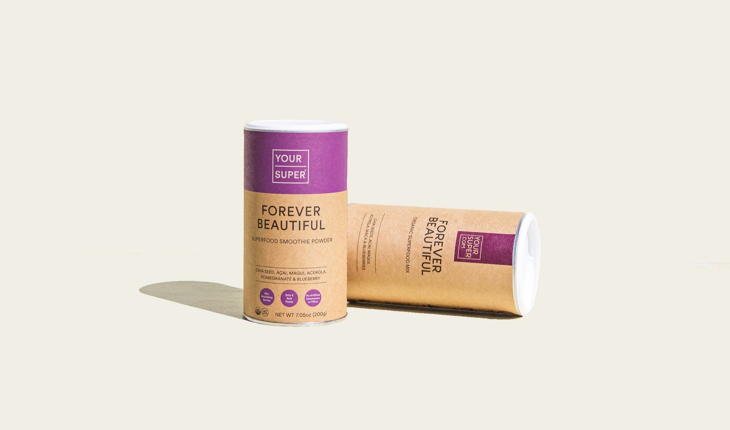
Project: Your Super Rebrand — Packaging
Role: Packaging Designer + Art Director Photography
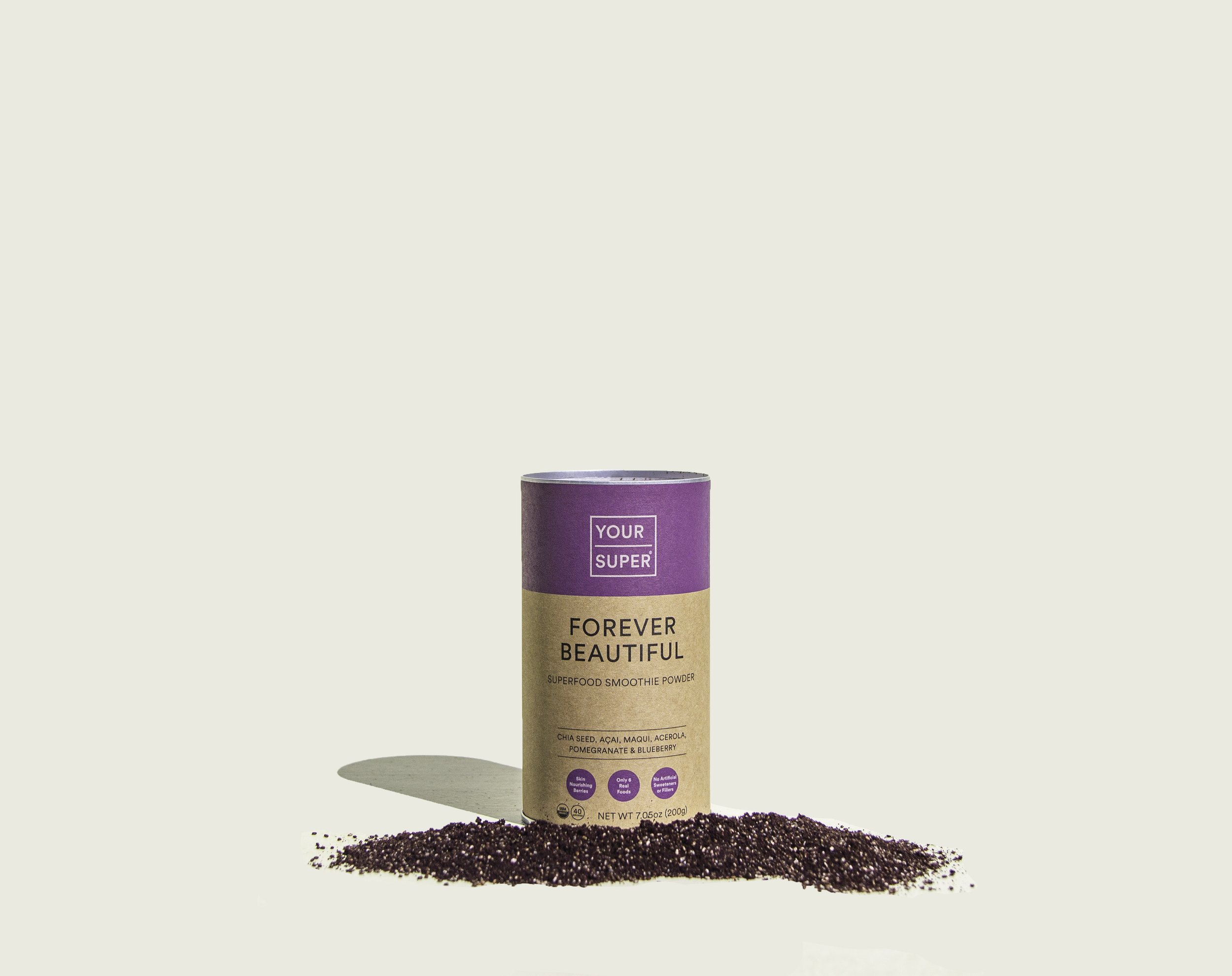
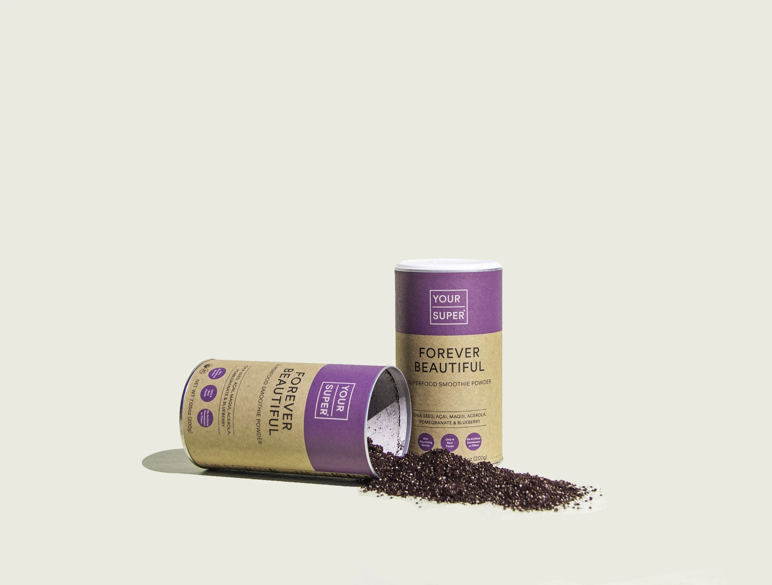
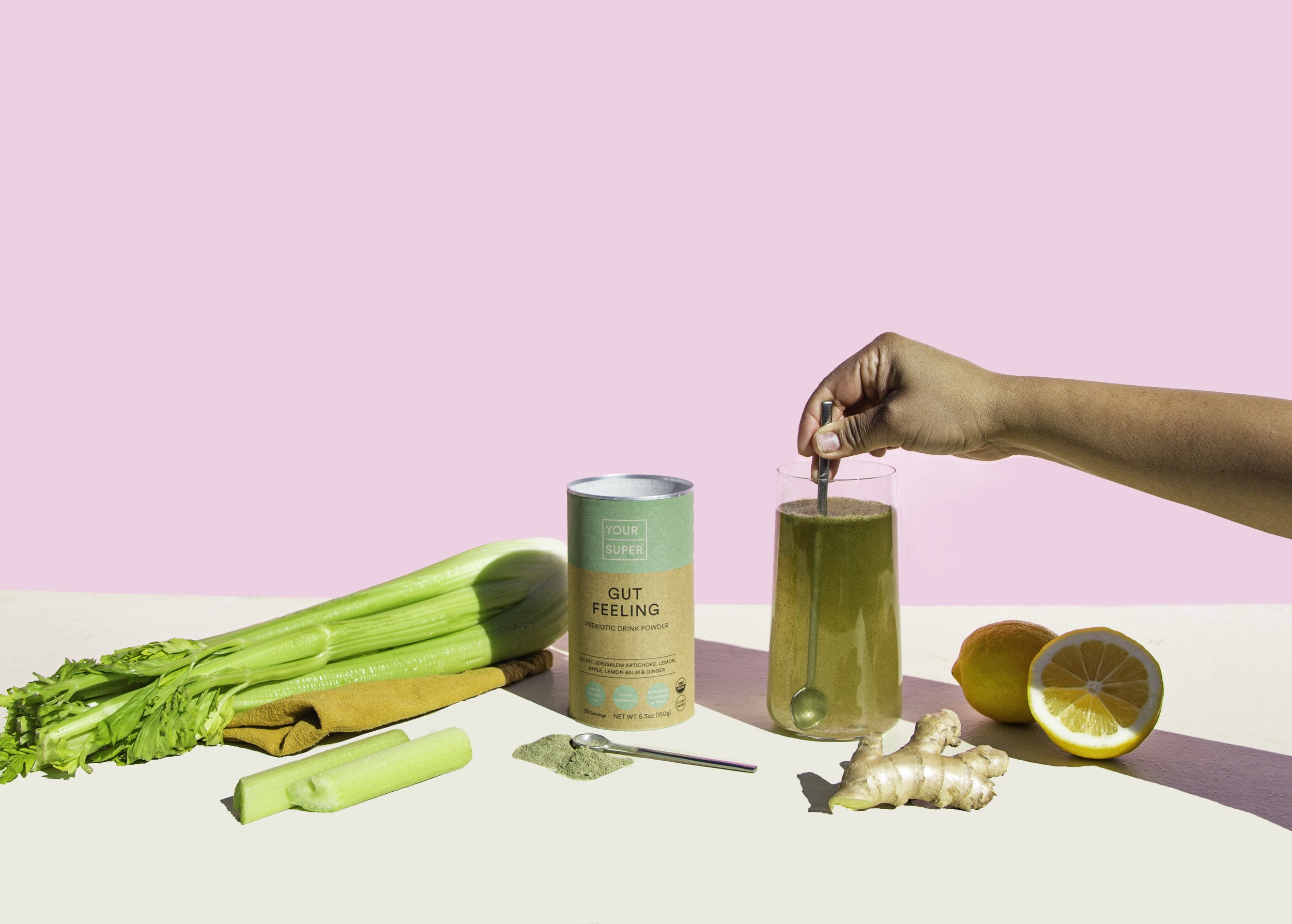
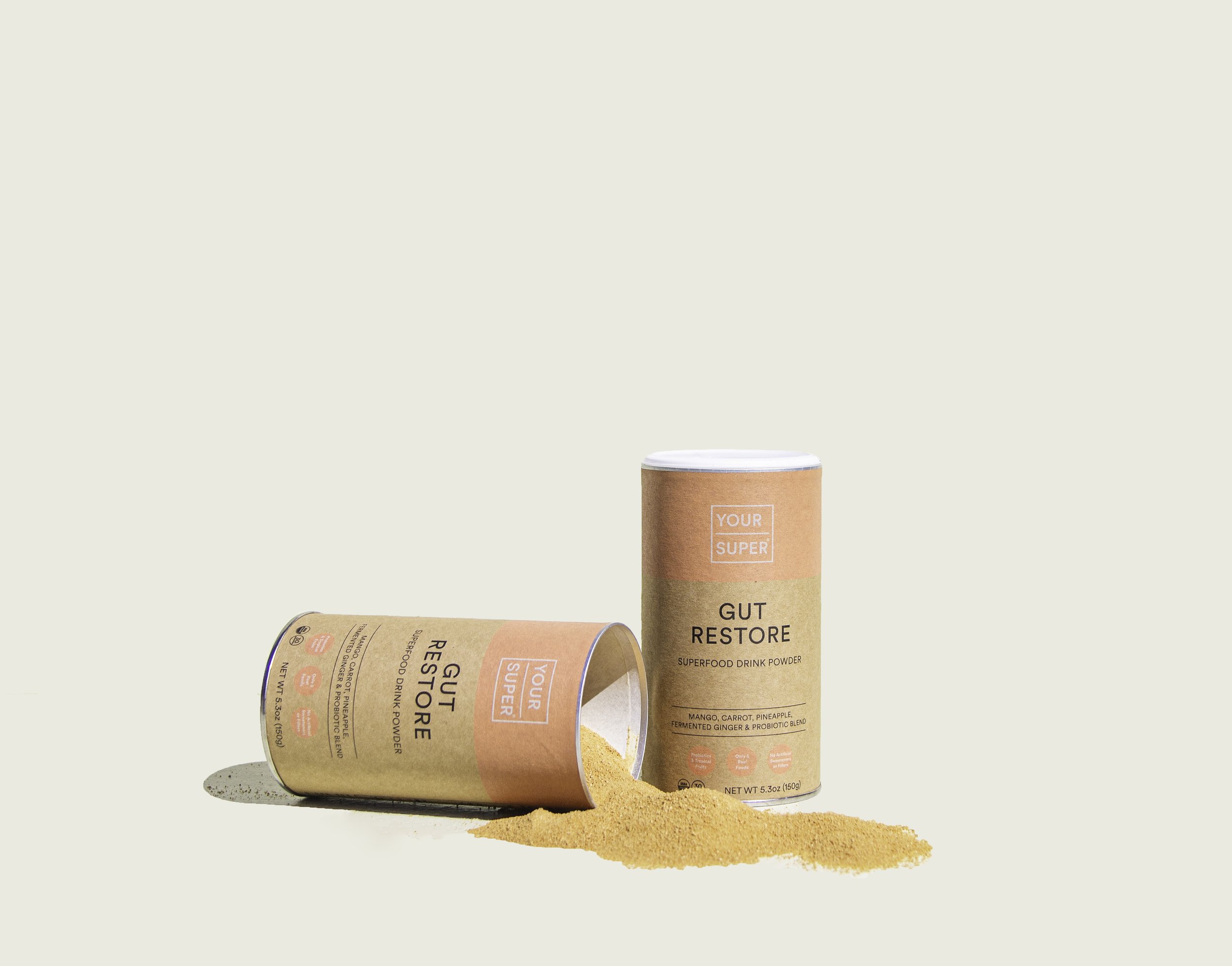
As part of the brand redesign, YourSupers packaging needed an upgrade too.
My challenge here was to refresh just enough to give the new design an edge to stand out on the shelf, but not so much to lose the character and history of its predecessor. The goal of this packaging upgrade was to create clarity around the benefit and use of the product.
So, what changed?
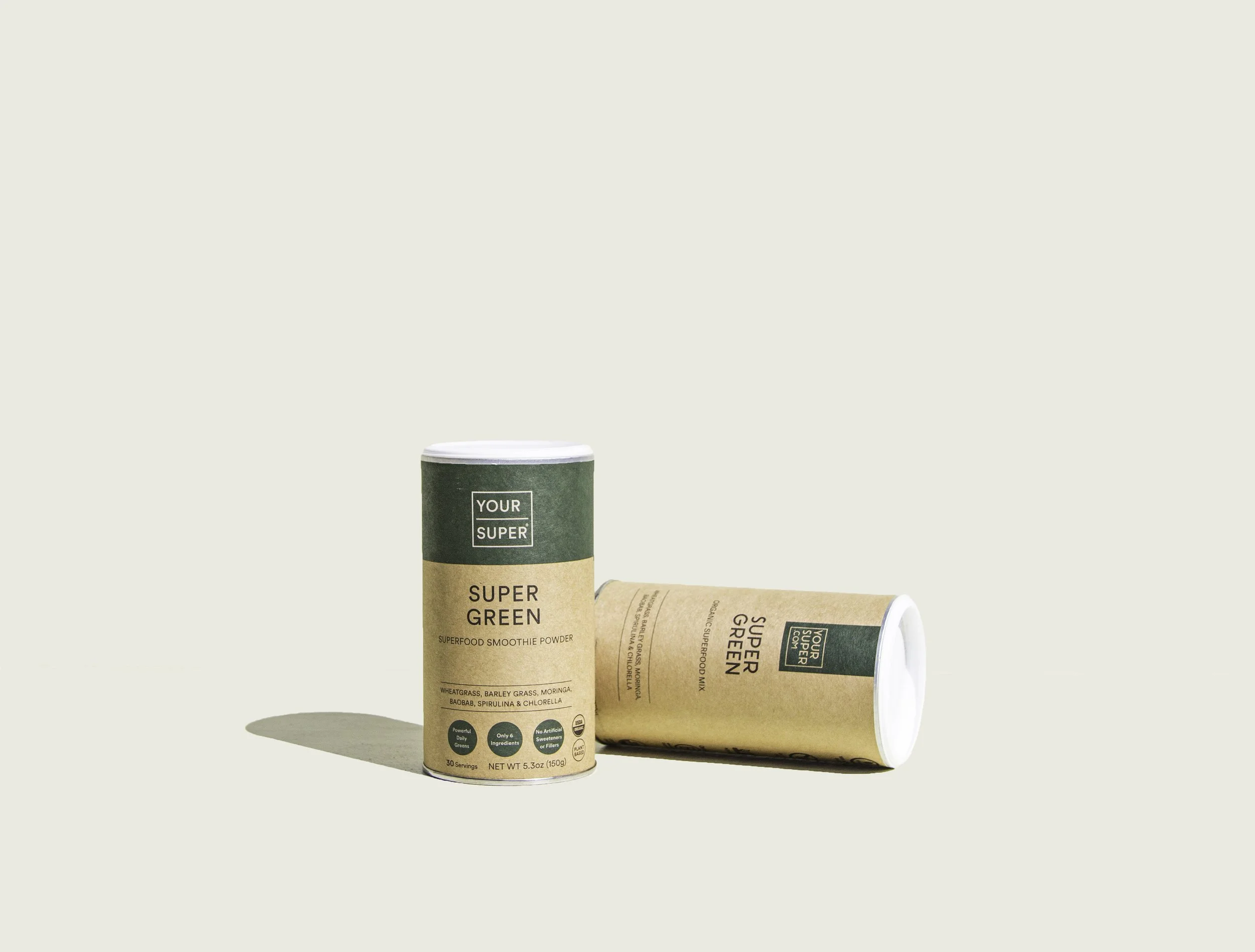
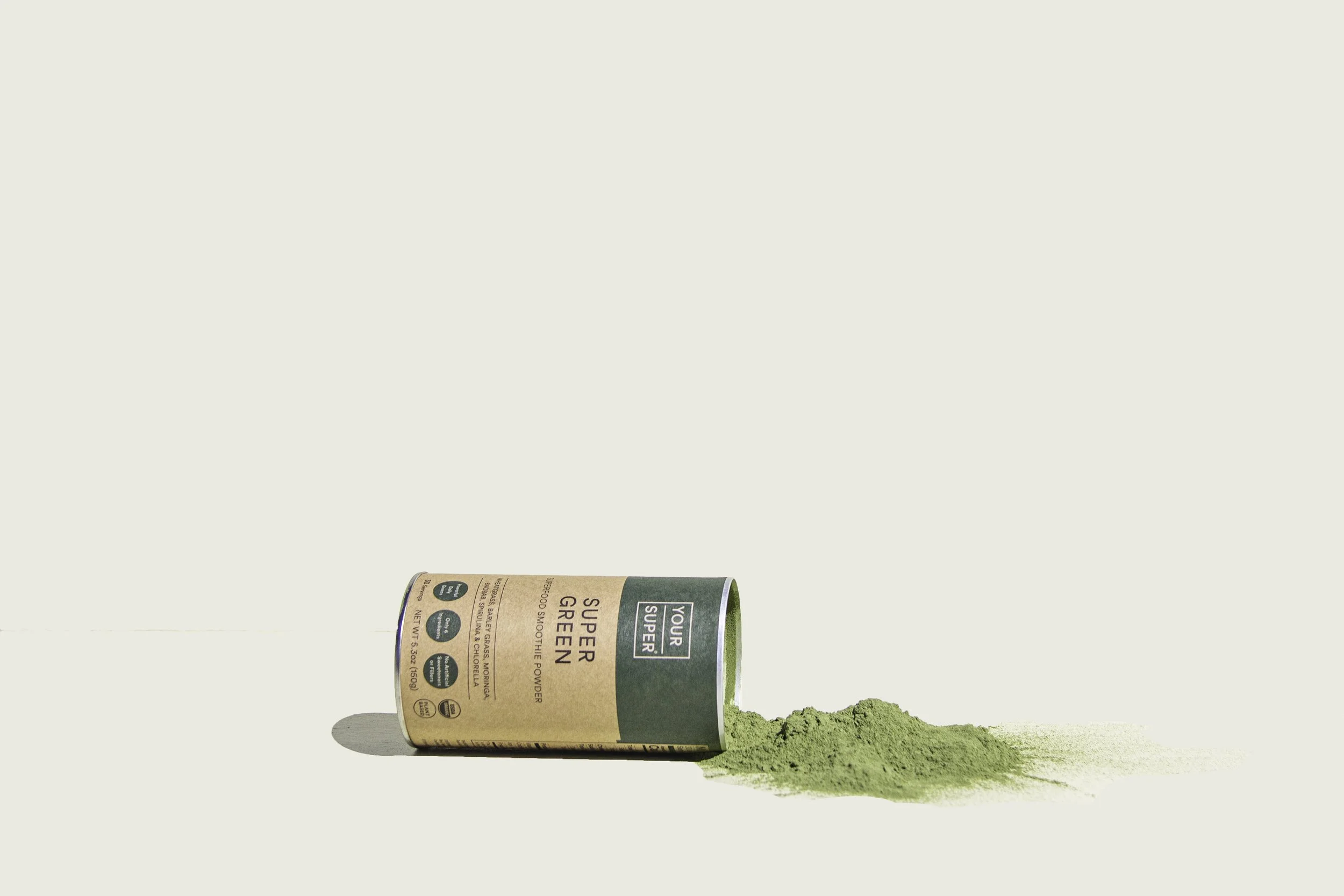
Clearer front of pack, highlighting the unique selling points and the main use case.
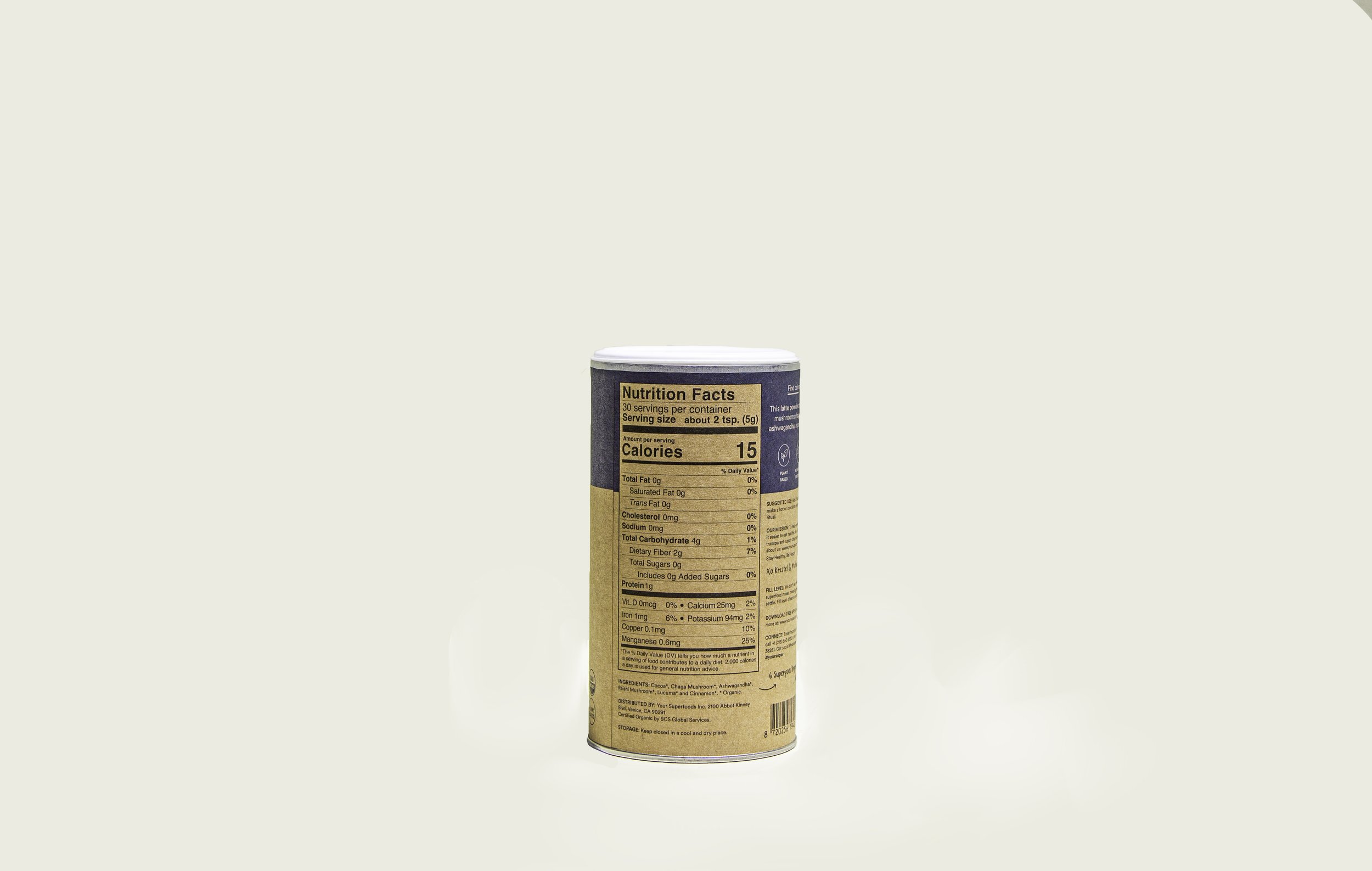
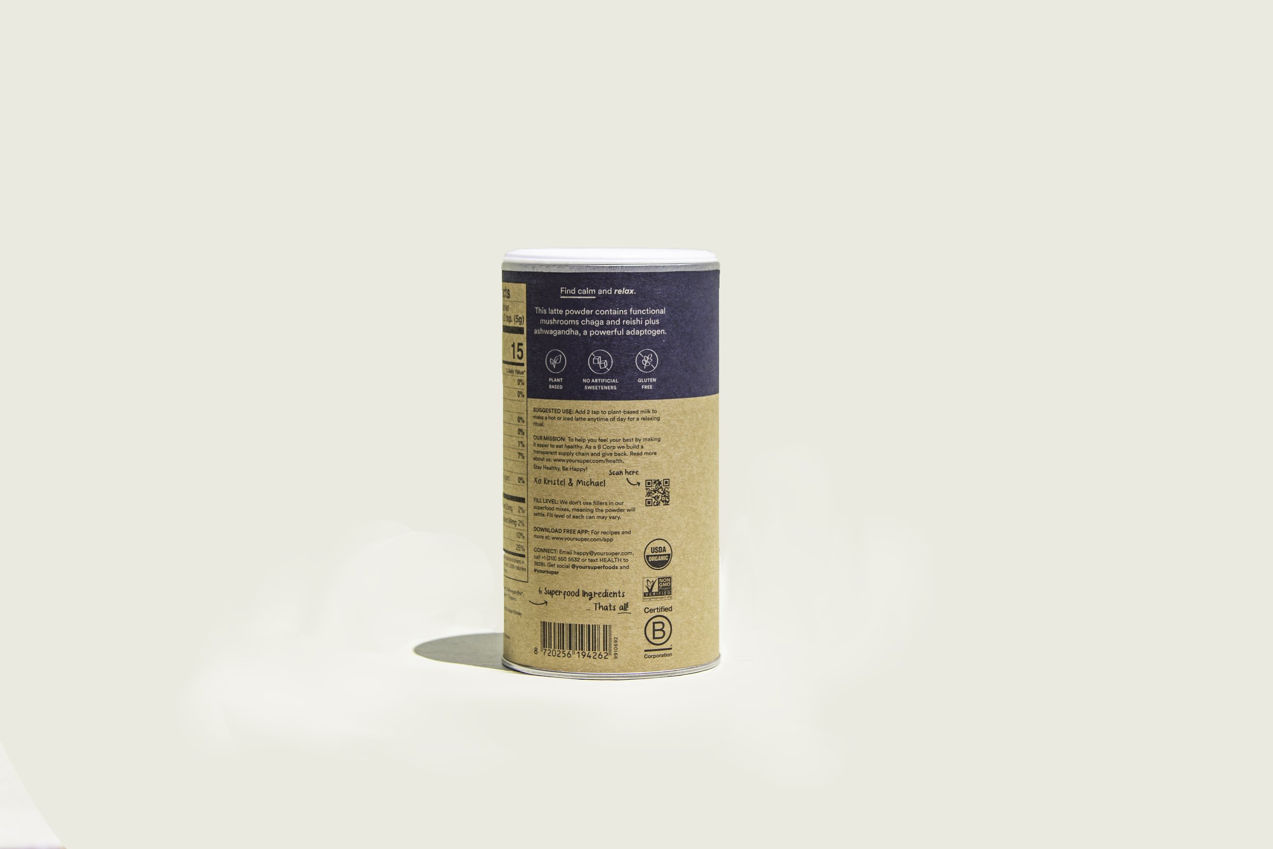
Use case and benefit written out clearly on the back of pack, along-side the unique selling points of the product.
A brightly coloured band all the way around the top of pack, creating unity as well as individuality between the products.
